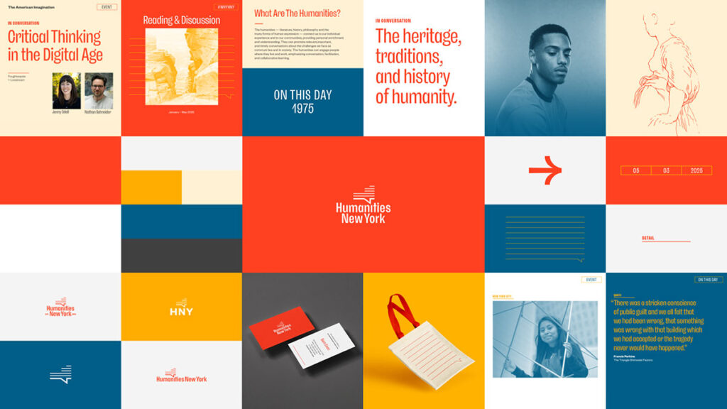
2025 is a milestone year for Humanities New York, marking 50 years since our founding by the National Endowment for the Humanities (NEH). In advance of the new year and a number of exciting developments including a website redesign and streamlined grants offerings, we’re proud to present a new brand aesthetic.
Spearheaded by Rich Greco—a celebrated independent brand designer and native New Yorker—with the help and support of HNY’s staff and Board, the redesign aims to reflect the continuous evolution of our work through expressions that convey the bold, creative, and imperfect ways that people forge meaningful connections through the humanities.
MARK
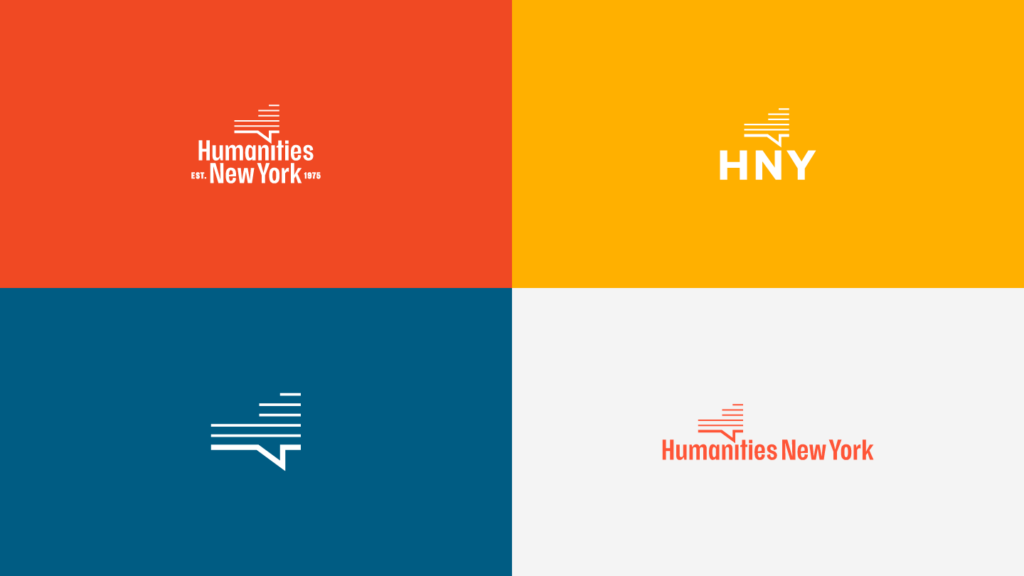
The cornerstone of the new aesthetic is a reimagined logo, which preserves the angular accent of the previous mark. Suggestive of the shape of the state and the baseline of a thought or speech bubble, the new mark expands upon its associations to underscore the fundamental role of dialogue in the work of grantees and the humanities writ large.
In addition to the primary mark, we’re adopting a number of variations designed for digital formats and flexibility across all types of communications. An anniversary mark bearing the year of our establishment is also included.
PALETTE
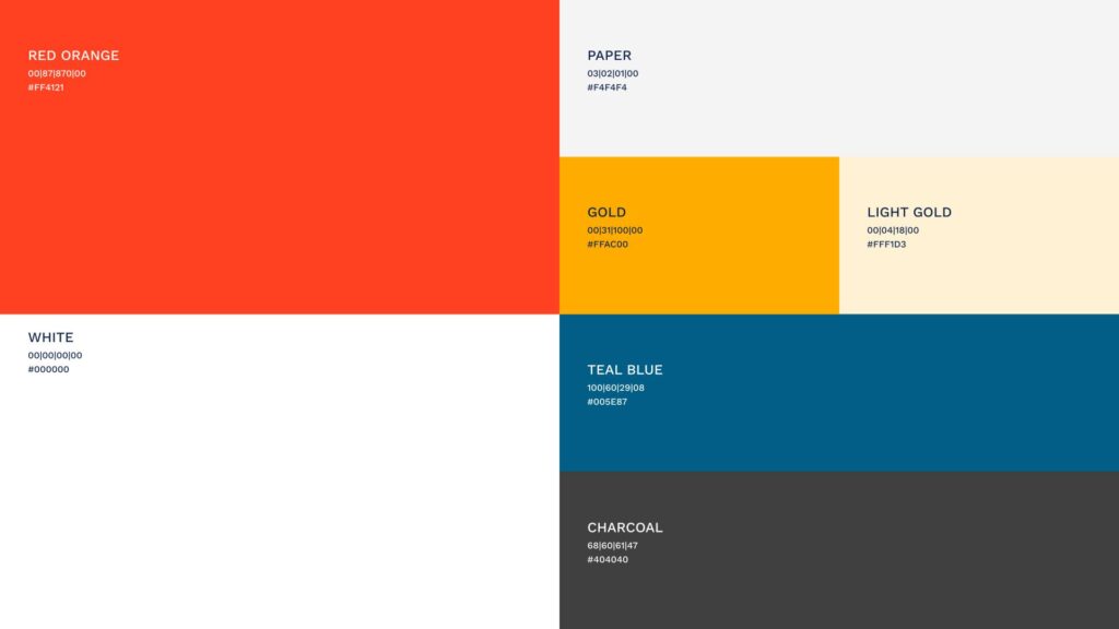
Colors are vibrant, conveying the passion and energy of non-profit grant recipients that comprise much of the state’s cultural sector.
Greco looked to the NYS state flag and an archival report from our first year of operation (1975) to kickstart an iterative process, culminating in a selection of colors grounded in New York’s diverse topography but extending to the sky.
TYPOGRAPHY
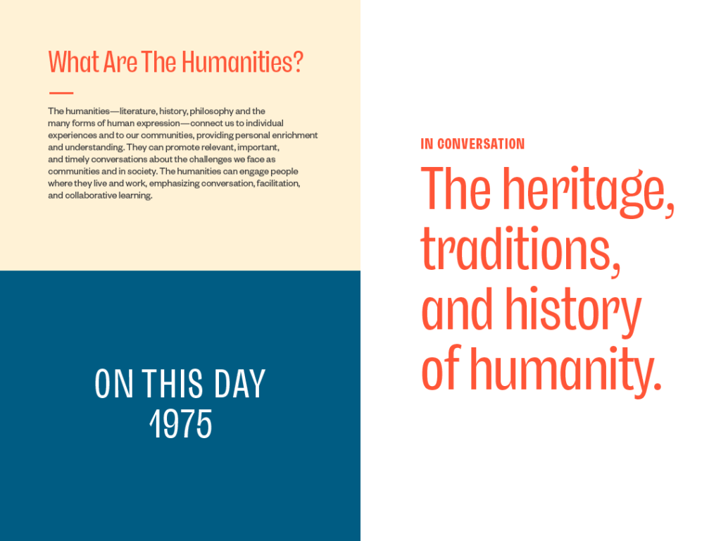
Fonts strikes a balance between exuberant flair and sedate clarity. Headline text engages readers with warmth and personality, with subtle flourishes suggestive of handwriting. Secondary text for body copy is versatile and suitable for all types of messaging with respect to the often challenging topics we face as communities.
IMAGERY
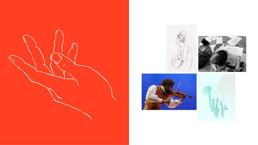
Representing the humanities is no easier than defining them. Our responsibility at HNY, however, is toward grantees whose work transfigures ideas into interventions that impact lives, communities, and even the course of history.
We endeavor to showcase grantee work whenever photos are available. But for the many cases where this isn’t possible or contextually appropriate, we’ve developed an approach that mines HNY’s archives as well as open access imagery offered by NYS institutions such as the New York Public Library and the Metropolitan Museum of Art. Photo visuals aim to capture moments of pause, reflection, and connection; illustrations exemplify the power of the head, heart, and hand when equipped with tools for expression.
SHAPES AND SYMBOLS
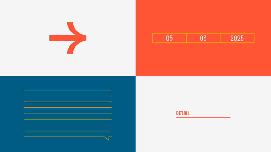
Since our last brand redesign in 2017, digital communications have become the primary means of interaction among people. To engage audiences most efficiently and effectively across platforms, we’re deploying a small, cohesive suite of visual cues that serve to organize and orient readers toward important information.
More than functional, these elements invite interpretation. In the eye of some beholders, a variation of lines drawn from our logo could call to mind an EKG monitor: a heartbeat.
Heading into 2025 , we’re thrilled by the artistic direction and its joining of our past and present with a future we foresee as more focused than ever on making a measurable impact on the people we serve. The new brand aesthetic is designed for you, our diverse and committed community, brought together by the sweeping scope and infinite potential of the humanities.
